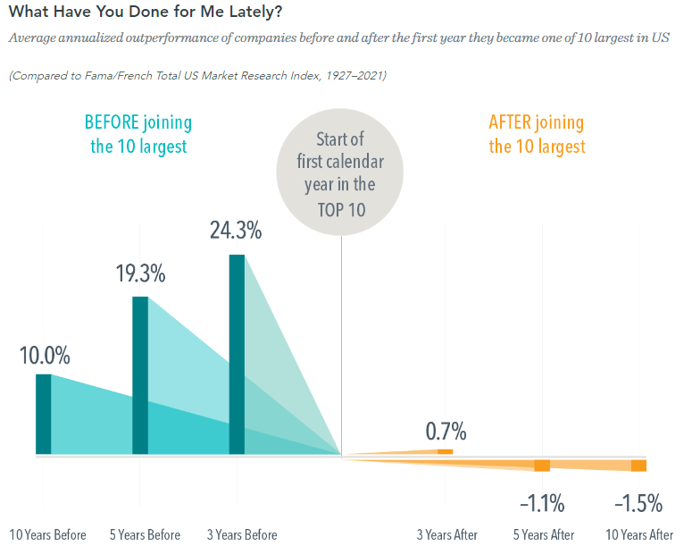
Here’s a great chart from DFA (thanks to Meb Faber for highlighting it on Twitter).1 It shows the average annualized outperformance of stocks after they’ve become one of the largest top 10 in the S&P 500. As you can see, the top 10 largest companies underperform by an average of -1.5% over the subsequent 10 years. This is related to our recent commentary on market cap vs equal weight indices and what’s driving the current rally in the S&P 500.
It makes sense when you think about. The beauty of indexing is that you own the haystack rather than worrying about the needles. So even though we know that the majority of performance is driven by a handful of stocks over time indexing works because you have exposure to those handful of stocks that drive the performance. You don’t have to try to pick the handful of stocks that generate most of the performance because you systematically own them within the index. And the reason market cap and equal weight indexing works is because they both have an inherent momentum effect in them where smaller firms are systematically added to the index as they become larger and larger firms fall out of it as they become smaller firms.
The equal weight index tends to exaggerate that impact because the smaller firms typically grow faster than the larger firms, but the exact opposite has been happening so far this year. It’s worth keeping in mind as we think about the current market environment since the equal weight index better reflects the broader macro landscape because it’s not as skewed by the handful of megecap tech firms that have driven the S&P 500’s performance. So while some people might look at the market and say “the stock market sure doesn’t care about any economic risks” the story is much more complex when you look under the hood.
1 – See DFA FAANGS Gone Value